
Have you ever walked into a room and felt something was slightly off? The furniture looks great, the colors work well, but there’s an invisible tension in the air. Often, the culprit is how decorative pieces are positioned on your surfaces.
Think of improper arrangement like a character wearing a bad wig in a movie. When it’s wrong, you can’t stop noticing the mistake. Design professionals spot these details immediately in living areas.
The most frequent errors include hanging creations too high and choosing pieces that are disproportionately small. These missteps can distract from your home’s natural beauty rather than enhancing it.
This comprehensive resource will transform how you approach displaying your favorite pieces. You’ll discover that proper arrangement is about more than just aesthetics—it creates visual harmony that changes how your entire environment feels and functions.
We’ll help you avoid common pitfalls that even design-conscious homeowners make. By the end, you’ll have the confidence to curate displays that look intentional, balanced, and professionally styled throughout your living space.
Understanding the Basics of Wall Art Placement
The way you position visual elements on your surfaces creates an immediate impression on anyone who enters. Mastering these fundamentals ensures your decorative pieces enhance rather than distract from your room’s overall appeal.
Why Proper Placement Matters
Correctly positioned decorative items work harmoniously with your furniture and architecture. They should feel like natural extensions of your space rather than awkward additions.
Proper placement also influences how the room feels and functions on a daily basis. Well-positioned pieces guide the eye, create balance, and prevent visual clutter. When artwork is thoughtfully placed, it enhances the overall atmosphere and makes the space feel more intentional and inviting.
Setting the Right Eye-Level for Art
The golden rule for hanging decorative pieces centers them at 57 inches from the floor. This measurement represents average eye level for comfortable viewing.
Think of your vertical surface divided into four equal sections from bottom to top. Your decorative elements should occupy the third quadrant for optimal visual balance. This approach prevents the common mistake of positioning items too high. It ensures viewers don’t need to crane their necks to appreciate your selections.
Adjust this standard based on your ceiling height and personal proportions. Taller family members or unique architectural features may require slight modifications to the 57-inch guideline.
When working with multiple pieces, treat the entire collection as one unit. Position the center of the complete arrangement at eye level rather than focusing on individual items.
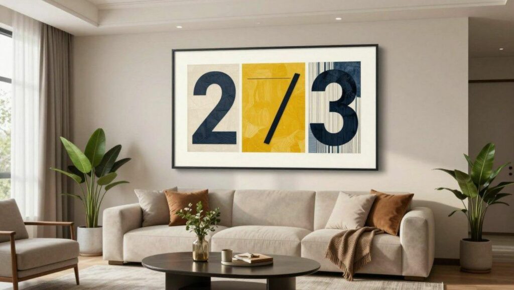
Navigating Proportions and the 2/3 Rule
Finding the perfect size for your decorative pieces can feel like solving a puzzle. The 2/3 rule provides a simple solution that creates harmony between your furniture and the items displayed above it.
Definition and Origins of the 2/3 Rule
This principle suggests your decorative piece should span about two-thirds of your furniture’s width. It comes from design traditions that value visual harmony, much like architectural golden ratios.
To apply this guideline, measure your furniture’s width and multiply by 0.66. For example, a 90-inch sofa pairs well with a 60-inch wide decorative element.
Practical Applications in Different Rooms
This approach works beautifully throughout your home. In living areas, scale your pieces to match two-thirds of your sofa’s width.
Bedrooms benefit from decorative items proportional to the headboard. Dining rooms look polished when pieces span two-thirds of your buffet or sideboard.
The beauty of this method lies in its flexibility. It prevents items from appearing too small or overwhelming, creating natural connections throughout your space.
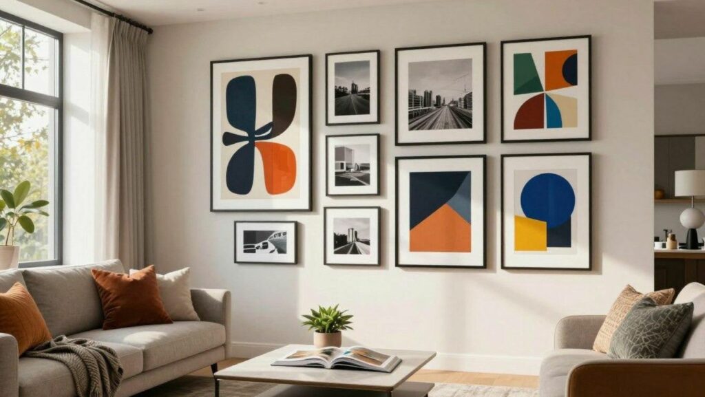
Curating a Gallery Wall and Arranging Art Pieces
When multiple artworks come together, they create a dynamic display that captures attention and conversation. This approach lets you showcase your favorite pieces in ways that tell a visual story throughout your space.
Designing a Cohesive Collection
Start by selecting a central anchor piece for your gallery. Build around this focal point with complementary works that share common elements. Consider similar color schemes, frame styles, or thematic connections.
The organic approach embraces variety in sizes and shapes. Mix different mediums like paintings, prints, and photographs. Maintain unity through echoing colors or consistent matting.
Balancing Scale and Composition
Treat your entire gallery as one unit when planning proportions. The combined width should relate to furniture below using the two-thirds guideline. This creates harmony between your display and room elements.
Collections of three work particularly well. Our brains naturally appreciate patterns, making trios especially pleasing. Arrange them horizontally or vertically based on your available space.
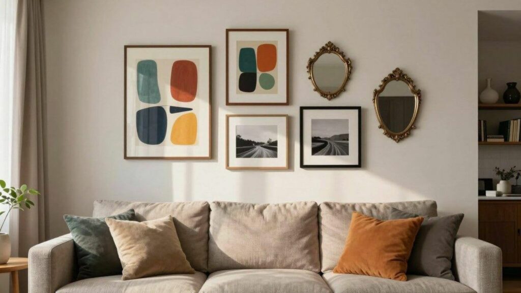
Adding Personal Meaning Through Custom Artwork
A gallery wall feels more complete when it includes pieces that carry personal value. Incorporating meaningful imagery adds emotional depth and helps turn a decorative layout into a visual story. Family moments, favorite memories, or milestone photos bring warmth and intention to the overall arrangement.
Custom artwork offers an elegant way to achieve this balance. Using Number Artist photo-to-art kits, you can transform a chosen photo into a painted piece that fits naturally among prints and framed designs. Coordinating frame styles or color tones helps the artwork complement the rest of the display while adding a unique personal touch.
Expert Techniques from the wall art placement guide
Professional designers have a few secret techniques that make their displays look effortless. These advanced methods take your arrangement from good to magazine-quality great.
Actionable Tips for Perfect Alignment
When hanging artwork above a sofa or console, maintain a 6–8 inch gap. This spacing creates a strong visual connection between the furniture and the piece without making the area feel crowded or compressed.
If you are unsure about your arrangement, take a photo of it and review the image from a distance. Viewing the space as if it belongs to someone else helps remove emotional bias and makes proportion issues easier to spot.
When choosing between sizes, leaning slightly larger is often the better option. Oversized pieces tend to feel deliberate and confident, while artwork that is too small can appear disconnected from the surrounding furniture.
Art should always relate to what sits beneath it. Treat the furniture and artwork as a single composition rather than separate elements working independently.
For grouped displays, use the available wall space intentionally. Align the overall shape of the collection with the proportions of the wall to achieve a clean, balanced, and professionally styled result.
Harmonizing Art with Furniture and Room Scale
The true magic of interior design happens when your furniture and decorative elements speak the same visual language. This harmony creates a sense of intention and polish that makes a room feel complete.
Getting this balance right transforms your space from a collection of items into a cohesive environment.
Measuring Furniture vs. Art for a Balanced Look
Your first step is always to measure your furniture, not the empty space above it. The sofa or console is the anchor that your decorative piece needs to relate to.
Apply the two-thirds rule directly to your furniture’s width. For example, if your sofa spans 84 inches, aim for a piece around 56 inches wide.
Overcoming Common Placement Mistakes
Many homeowners encounter a few predictable hurdles. Recognizing them is the first step toward a perfectly styled room.
Here are the most frequent errors to avoid:
- Ignoring Visual Weight: A large, substantial sofa needs equally bold artwork. Delicate furniture pairs best with lighter, more refined pieces.
- Disregarding Room Context: A selection that works in a standard-height dining room might look lost in a living area with soaring ceilings.
- Hanging Too High: The habit of positioning items near the ceiling line forces you to crane your neck. Lowering your pieces is often the simplest fix.
Thinking of your furniture and artwork as a unified composition is the key to success. They should work together to activate your space beautifully.
Creative Art Arrangements for Different Spaces
Your home’s different rooms each deserve their own special approach to displaying decorative works. The choices you make should enhance each area’s unique character and purpose.
Gallery Walls Versus Single Statement Pieces
Single large statement pieces create dramatic focal points in key areas. They work beautifully above sofas in your living room or dining room buffets.
These bold selections instantly draw attention and establish an atmosphere. A stunning oversized canvas can anchor an entire space with confidence.
Gallery walls offer more flexibility for showcasing collections. They let you mix various prints and photographs into dynamic displays.
This approach works well for filling larger expanses and expressing personality. Your living area might benefit from a collected, layered look above seating.
Adapting Layouts to Unique Room Structures
Rooms with high ceilings often need larger or vertically oriented arrangements. This prevents pieces from looking too small against tall surfaces.
Architectural features like fireplaces require complementary designs. Center or align your selections to enhance rather than compete with these elements.
Different spaces throughout your home serve different functions. Your arrangements should reflect this practical reality while creating visual harmony.
Conclusion
Thoughtful wall art placement has the power to change how you experience your home every day. When pieces are positioned with care, your rooms feel calmer, more balanced, and easier to enjoy. The goal is not perfection, but intention. Small adjustments can create a sense of flow that makes your space feel more welcoming and visually comfortable.
As you refine your displays, trust your instincts as much as the guidelines. Your home should reflect how you live and what inspires you. With patience and experimentation, each wall becomes an opportunity to express personality while supporting the atmosphere you want to create. Over time, these choices shape a space that feels cohesive, lived-in, and genuinely yours.